

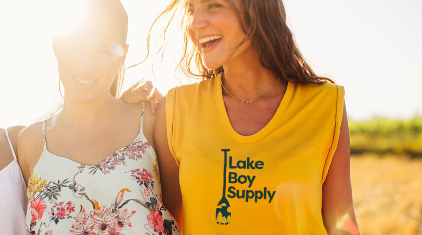
Lake Boy Supply is a lifestyle brand concept inspired by long days on the water, laid-back afternoons, and nights spent with friends. Designed for a style-conscious audience that embraces an easygoing attitude, the brand brings a modern perspective to lake culture.
Brand Strategy: Lake Boy Supply is a lifestyle brand concept inspired by long days on the water, laid-back afternoons, and nights spent with friends. Designed for a style-conscious audience between 20 and 40, the brand celebrates the social side of lake life with a modern, easygoing attitude.
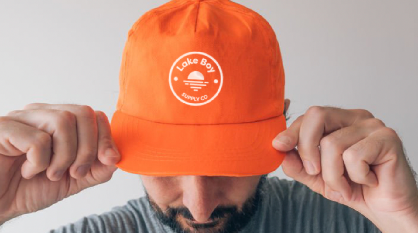
Visual Identity & Apparel: The logo establishes a recognizable foundation for the brand, while the T-shirt and hat designs translate its personality into wearable merchandise. The approach balances a relaxed, approachable feel with a contemporary aesthetic designed to resonate on and off the water.
The Result: Live Lake Day. Every Day.
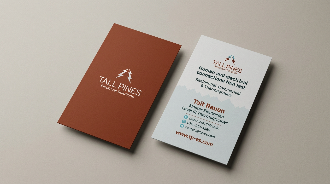

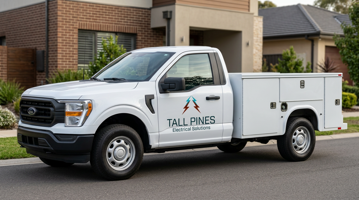
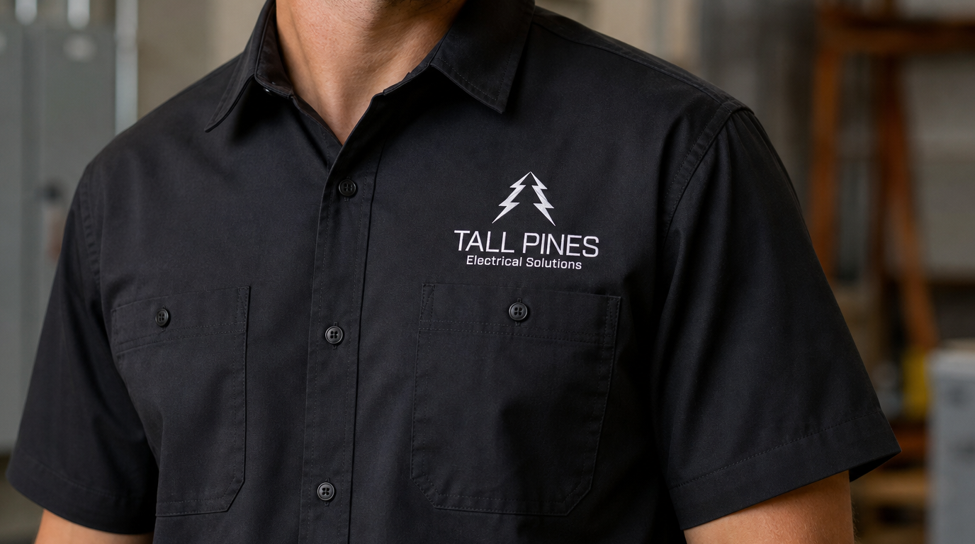
Tall Pines Electrical Solutions needed a distinctive visual identity that reflects its work in the electrical industry while establishing a professional, memorable brand.
The Concept: The logo combines the silhouette of a pine tree with the recognizable form of a lightning bolt, connecting the company's name with its electrical services in one cohesive mark. The goal was to create an identity that feels strong, straightforward, and recognizable.
Bringing the Brand to Life: Building on the new identity, I designed business cards that carry the brand across everyday client interactions. The design balances clear, accessible information with a cohesive visual style, creating a professional first impression and reinforcing brand consistency.
The Result: A unified brand identity and business card design that give Tall Pines Electrical Solutions a recognizable, professional presence across its customer-facing materials.
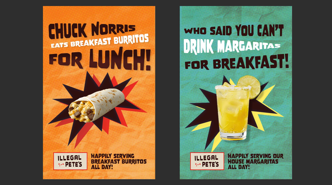
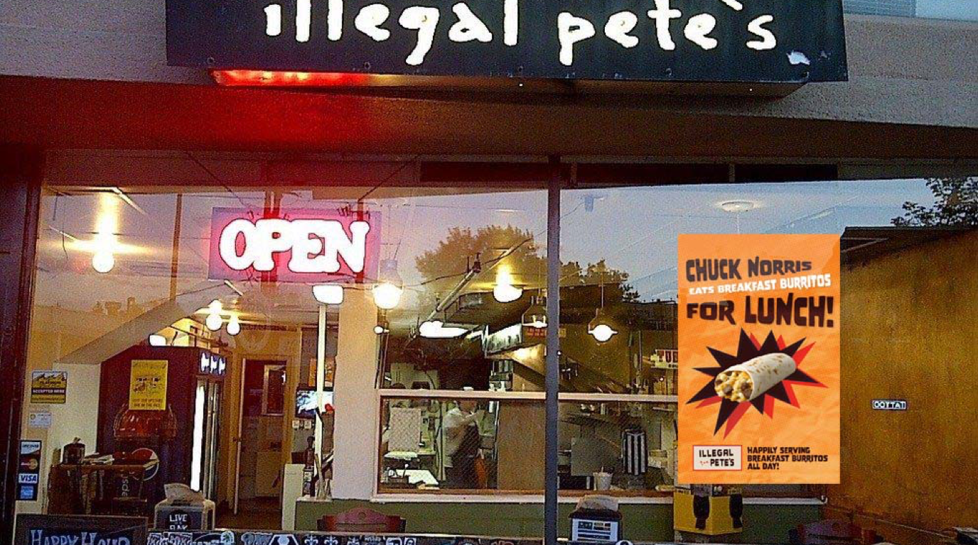
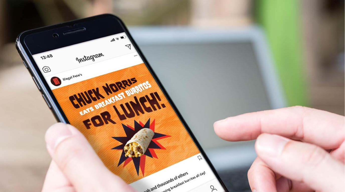
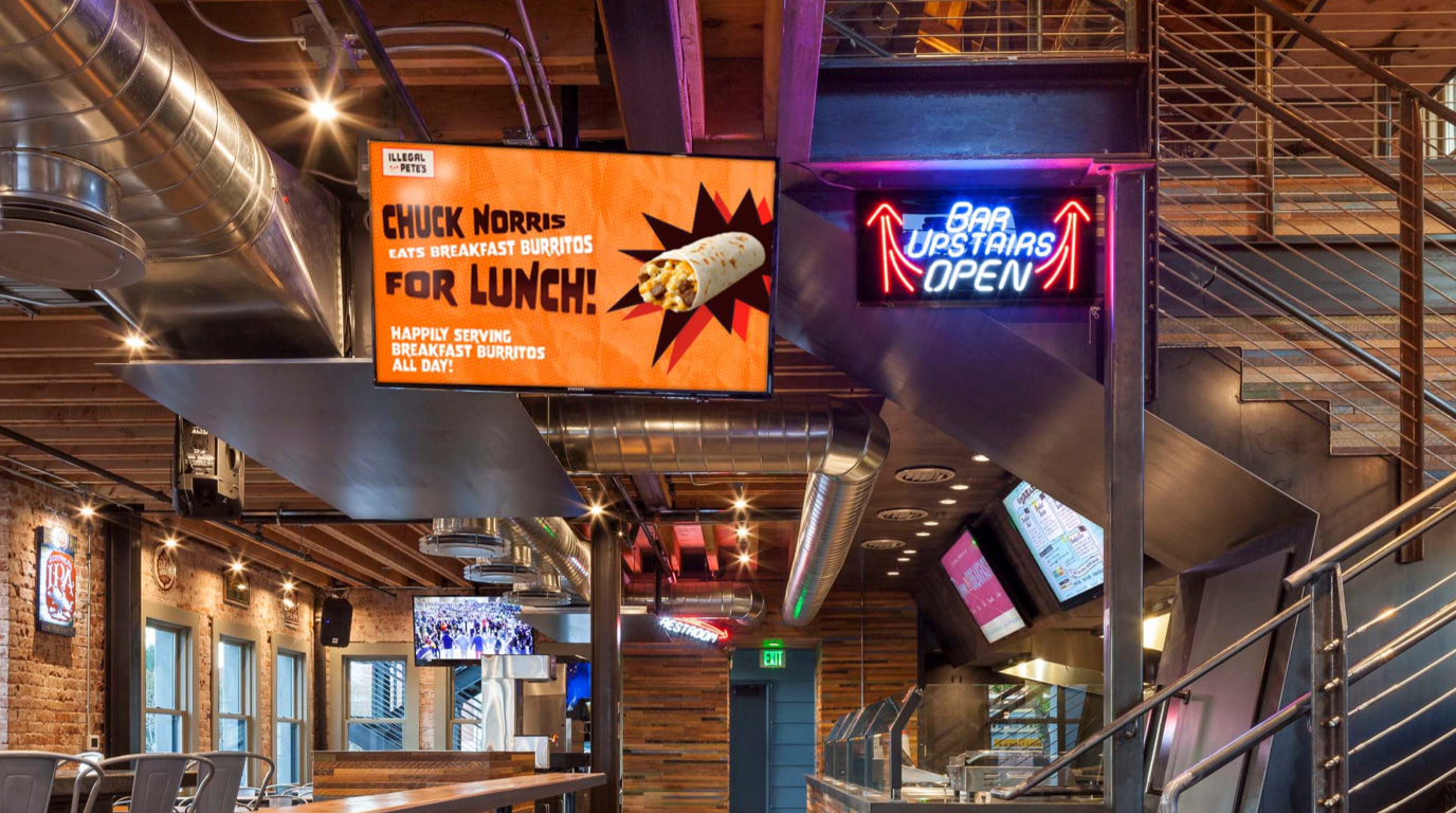
Illegal Pete’s, a beloved Colorado-based restaurant and music venue known for its laid-back vibe and community focus, needed a bold visual concept to amplify their brand across multiple channels. The challenge was to create a standout poster design that could flex seamlessly across formats—TV screens, printed posters, and social media—while capturing the rebellious, high-energy spirit of the brand.
The Concept: Illegal Pete’s, known for its rebellious spirit and deep ties to local culture, needed a bold visual concept that could energize their brand across multiple platforms. I created a dynamic poster design rooted in gritty textures, expressive typography, and bold composition—capturing the essence of the brand while leaving room for variation. The core concept was designed to be modular and scalable, allowing for a series of posters to be developed with the same visual DNA while promoting different events, specials, or brand messages.
Cross-Platform Adaptability: To ensure consistency across all brand touchpoints, the design system was built for flexibility—scaling seamlessly from printed posters to in-store TV displays and social media content. This adaptability allows the visuals to maintain impact across formats while enabling quick updates and variations as needed.
Outcome: The result is a reusable, cohesive visual campaign that amplifies Illegal Pete’s personality across digital and physical spaces. The scalable system empowers the brand to quickly roll out new creative with a unified aesthetic, strengthening brand recognition while keeping content fresh. With a foundation in place, multiple posters can now be created within the same style—streamlining future design efforts and reinforcing Illegal Pete’s distinct voice.
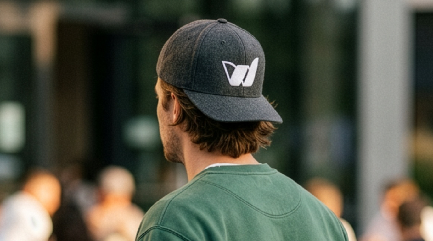


WAHI is an investment group focused on franchise opportunities. The goal was to establish a distinctive, professional brand identity that gives the company a recognizable presence across its business materials and branded merchandise.
Brand Design: The WAHI logo was designed to create a clear, cohesive visual identity that translates across a variety of applications. The design provides a consistent foundation for the brand, balancing a professional business presence with a versatile, modern aesthetic.
Branding Collateral:The identity was carried through to business cards and a custom T-shirt design, extending the brand beyond its core logo. Each application was designed to maintain visual consistency while adapting the identity to different formats and uses.
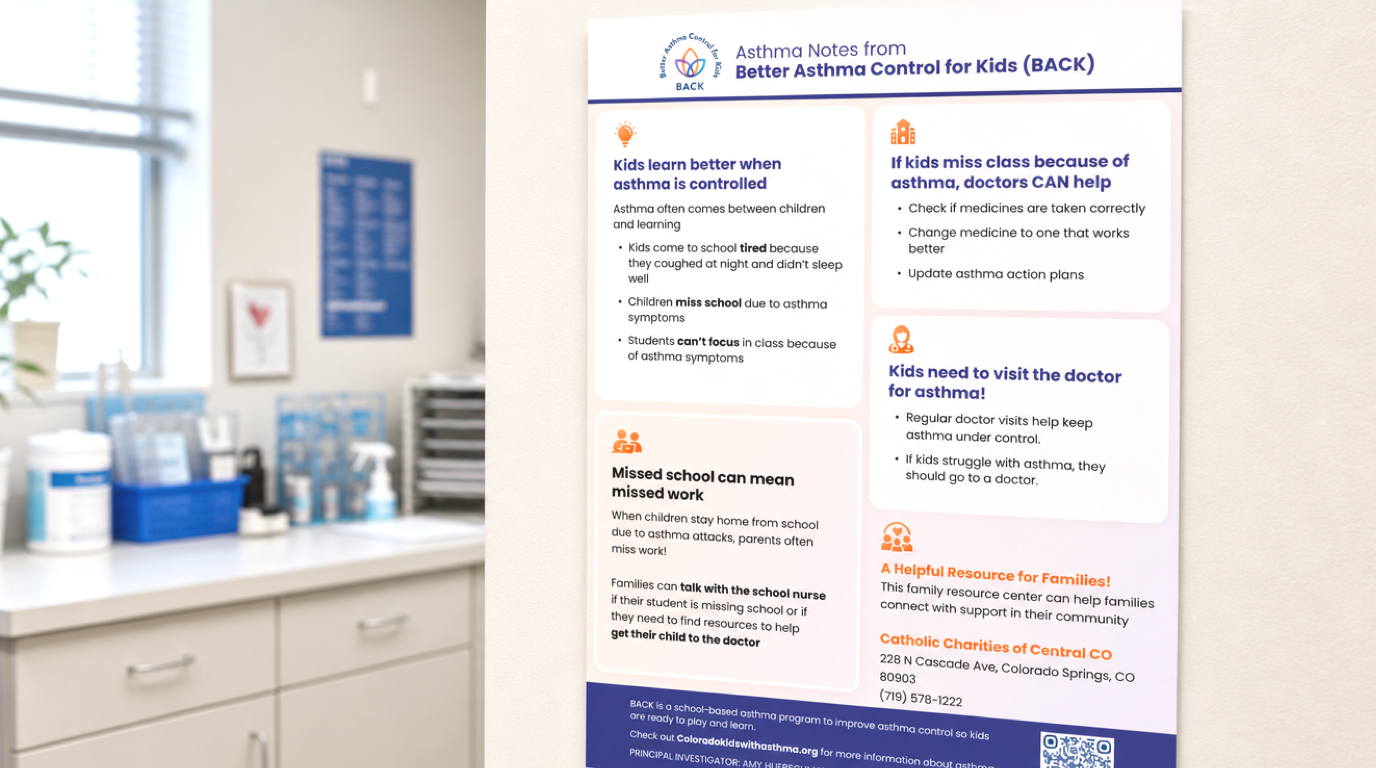
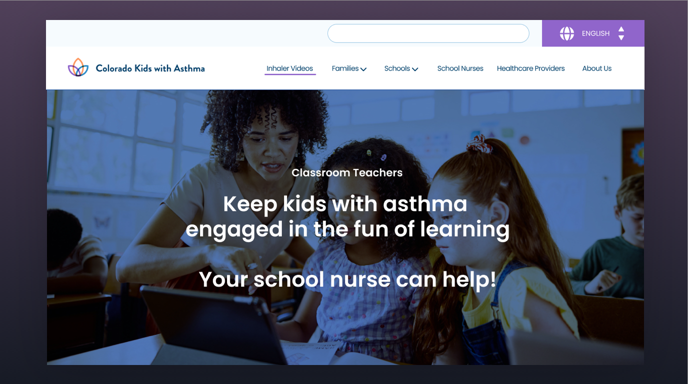
Asthma is one of the most common chronic conditions affecting children, and managing it requires coordination between families, healthcare providers, and schools. For children, uncontrolled asthma can mean missed school days, disrupted activities, and unnecessary barriers to learning and everyday life.
Colorado Kids With Asthma works to address these challenges by connecting the people who care for children with the education, tools, and resources they need to support effective asthma management. The initiative helps bridge the gap between healthcare and education, empowering school communities and families to work together so children can breathe easier and thrive.
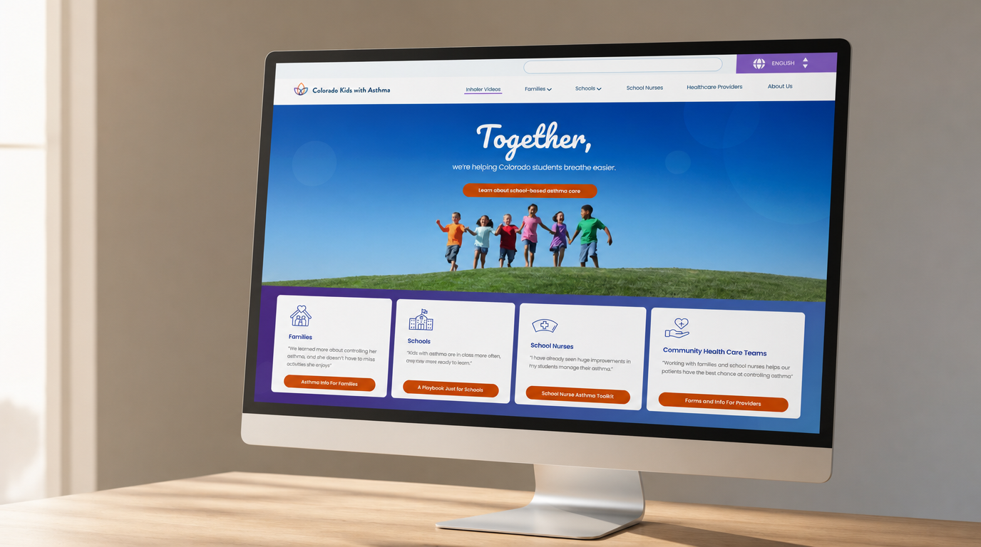
The Approach: The goal was to create a cohesive visual identity and digital experience that makes important health information accessible, approachable, and easy to understand. The website serves as a central resource for families, educators, school nurses, and healthcare professionals, helping them find practical guidance and information to support children with asthma.
The design emphasizes clear communication, intuitive navigation, and an organized presentation of educational resources. By making complex health information easier to navigate, the experience helps users find relevant guidance and better understand the role they play in supporting a child's health.
Branding Collateral:Alongside the website, I designed the Colorado Kids With Asthma logo and informational flyers to extend the initiative's identity across digital and print communications. The logo establishes a recognizable visual foundation, while the flyers provide an additional way to share educational information with families and school communities.Together, these elements create a consistent communications system that supports the program's broader mission: improving asthma awareness, encouraging effective management, and helping Colorado children stay healthy, active, and engaged in school and everyday life.
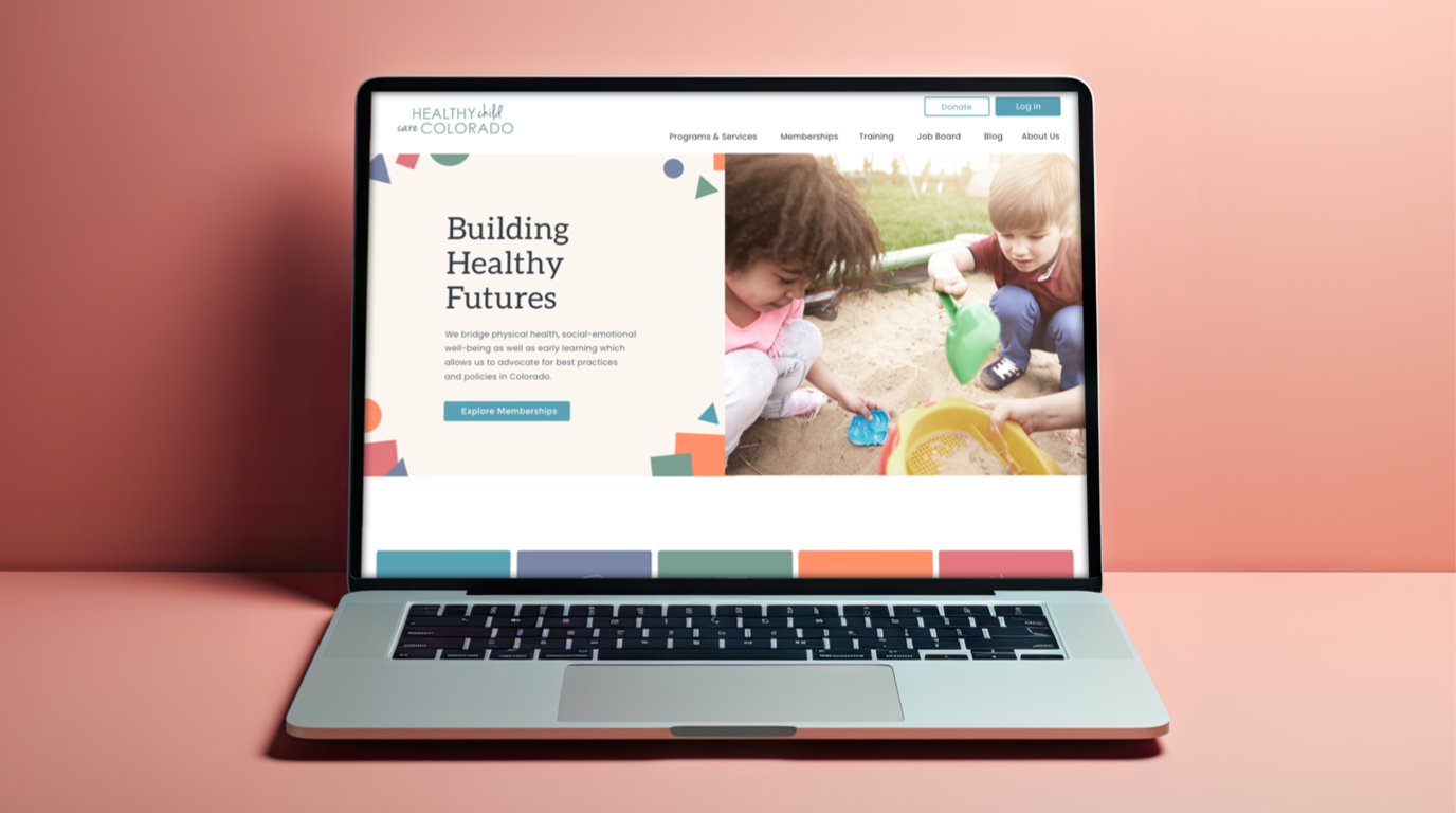
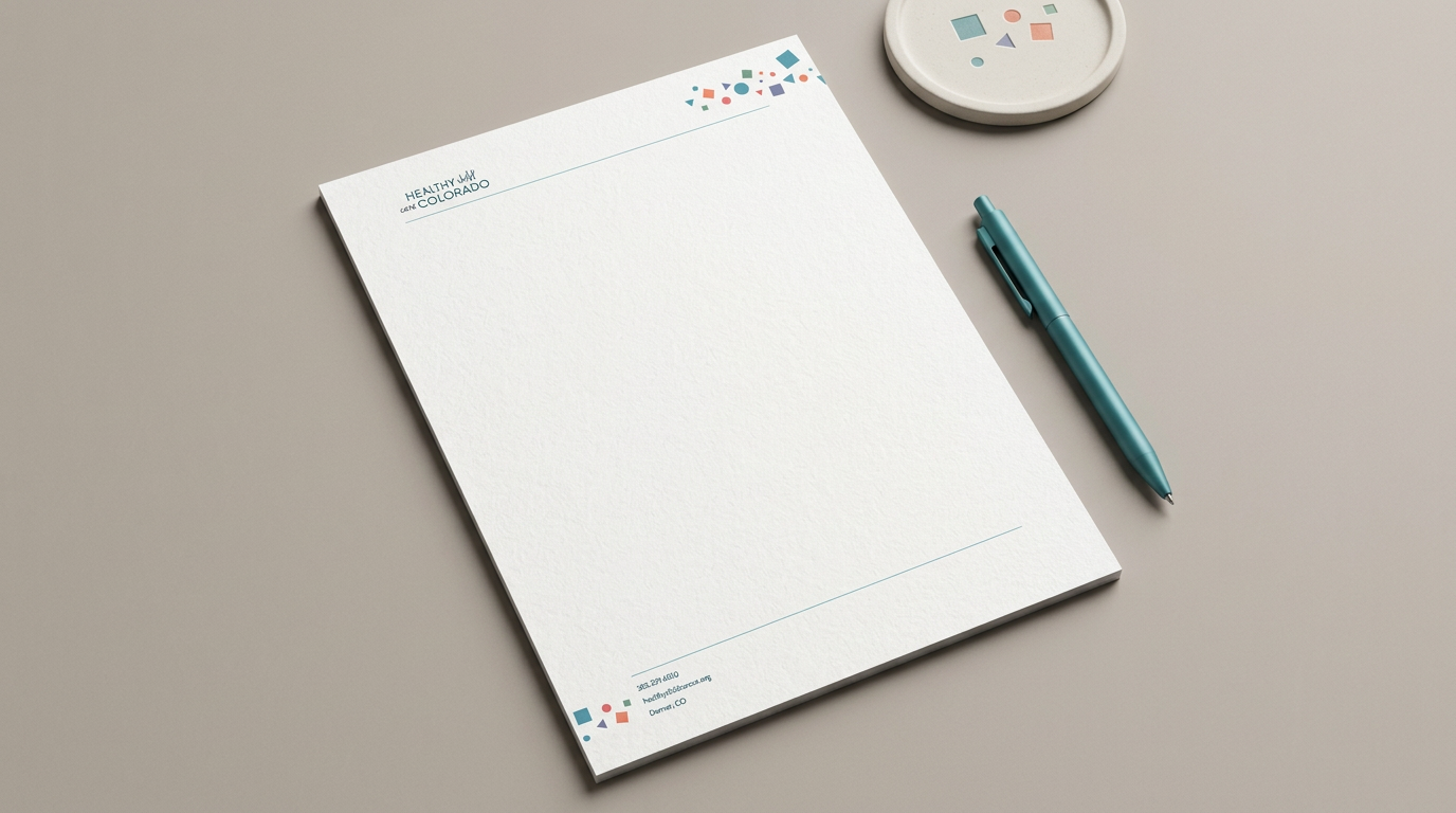
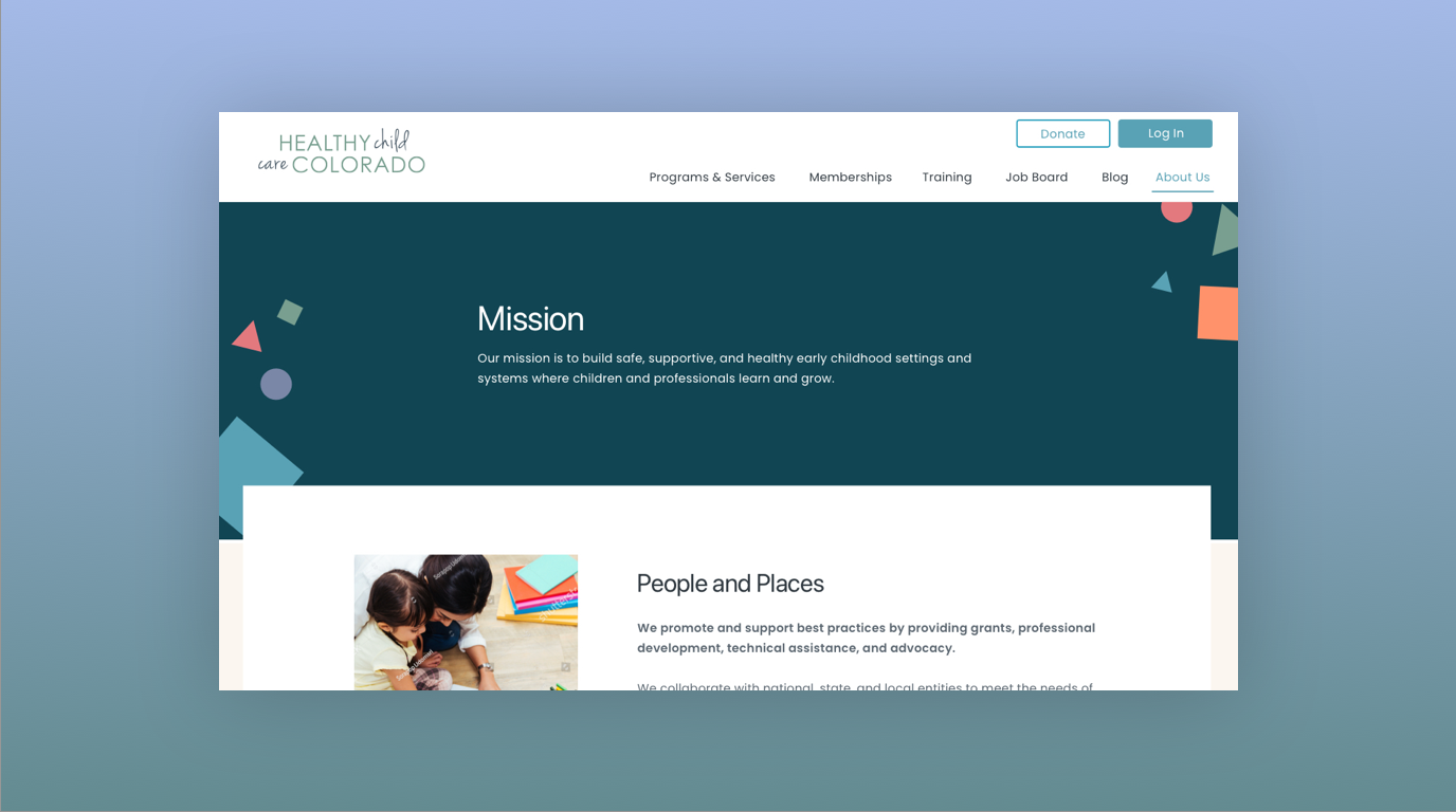
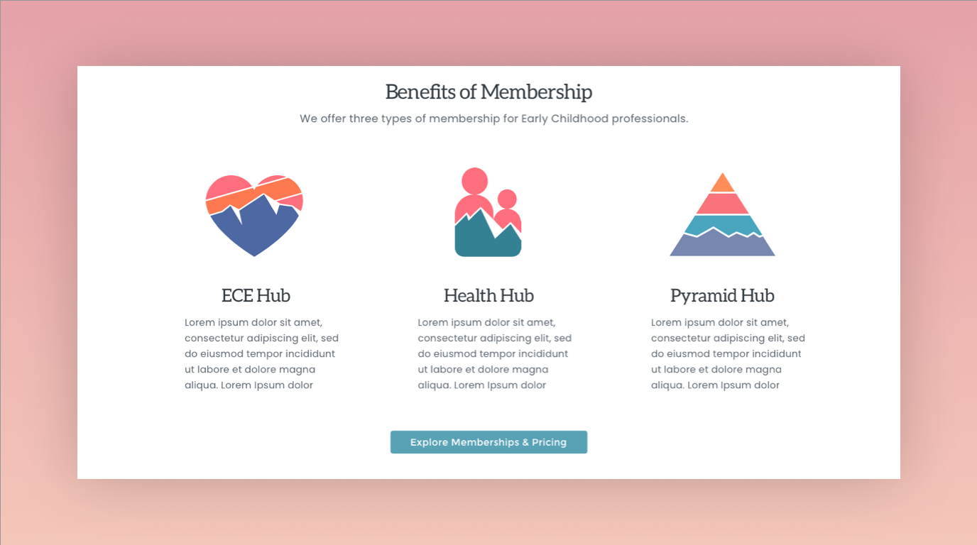
HCCC, a Colorado-based organization dedicated to enhancing health, safety, and well-being in early childhood settings and systems needed to amplify their impactful work through a comprehensive redesign. The challenge lay in revitalizing their digital presence while maintaining a cohesive brand identity across various collateral.
Website Design: The previous website lacked user-friendliness and failed to effectively communicate HCCC's mission and initiatives. Through a strategic approach grounded in user experience principles, I redesigned the website to prioritize intuitive navigation and compelling visual storytelling. By implementing clean layouts, vibrant imagery, and clear calls-to-action, the new website serves as an engaging hub for visitors to explore HCCC's resources and programs.
Branding Collateral: In addition to website redesign, I crafted cohesive branding collateral including business cards, letterhead, and logos for HCCC's diverse programs. Each design element was meticulously curated to reflect the organization's values of inclusivity, professionalism, and dedication to early childhood health and safety. By leveraging typography, color psychology, and consistent visual elements, I ensured that HCCC's brand identity resonates across various touchpoints, reinforcing their credibility and commitment within the community.
Outcome: The comprehensive redesign breathed new life into HCCC's digital presence, enhancing their ability to reach and engage with stakeholders. The intuitive website navigation facilitates seamless access to resources, fostering collaboration and knowledge-sharing among early childhood professionals. The unified branding collateral exudes professionalism and fosters brand recognition, positioning HCCC as a trusted leader in their field. Overall, the redesign empowers HCCC to further their mission of nurturing healthy and safe environments for children in Colorado.

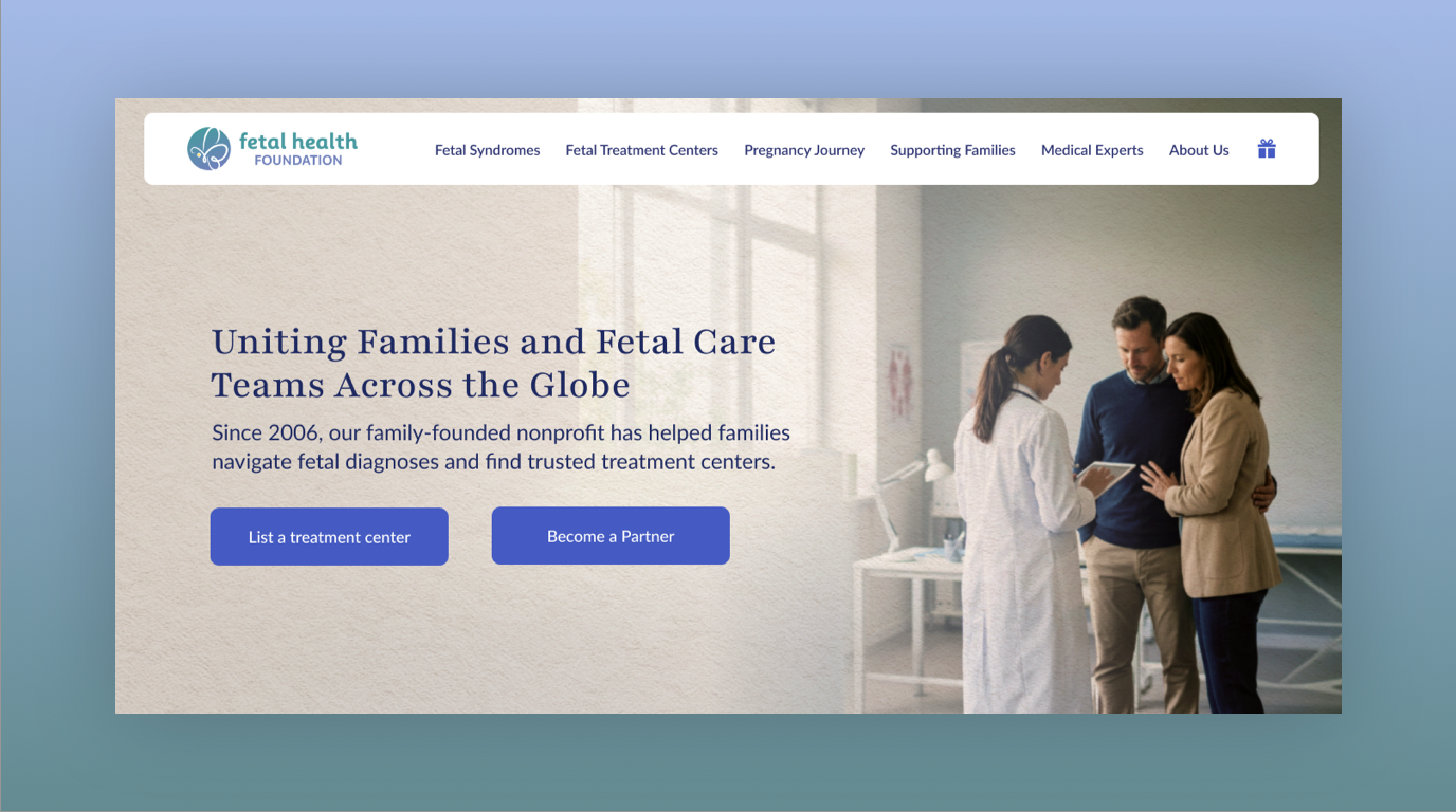
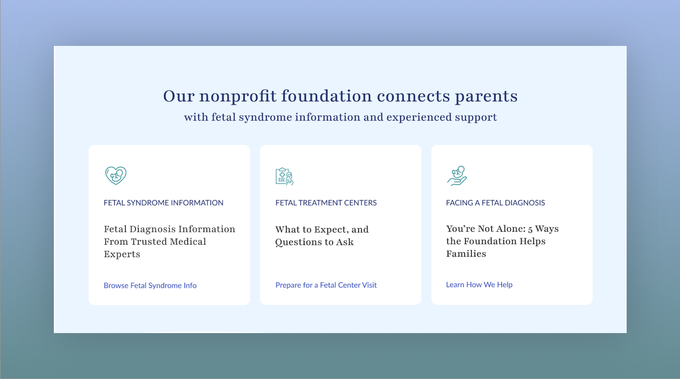
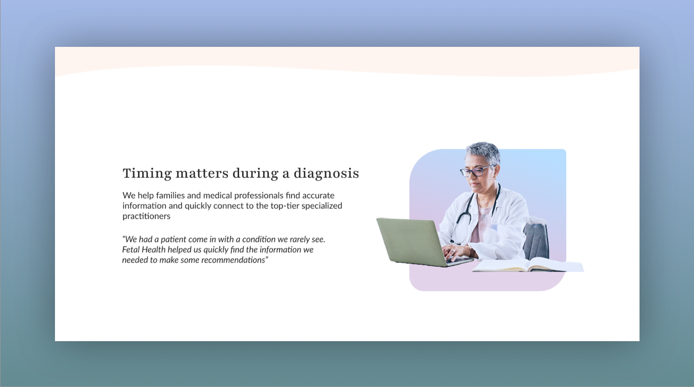
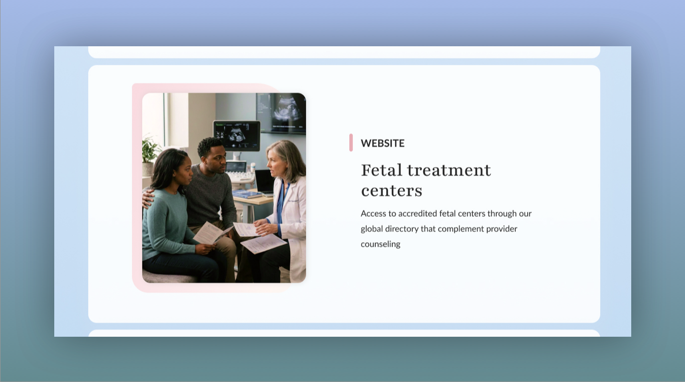
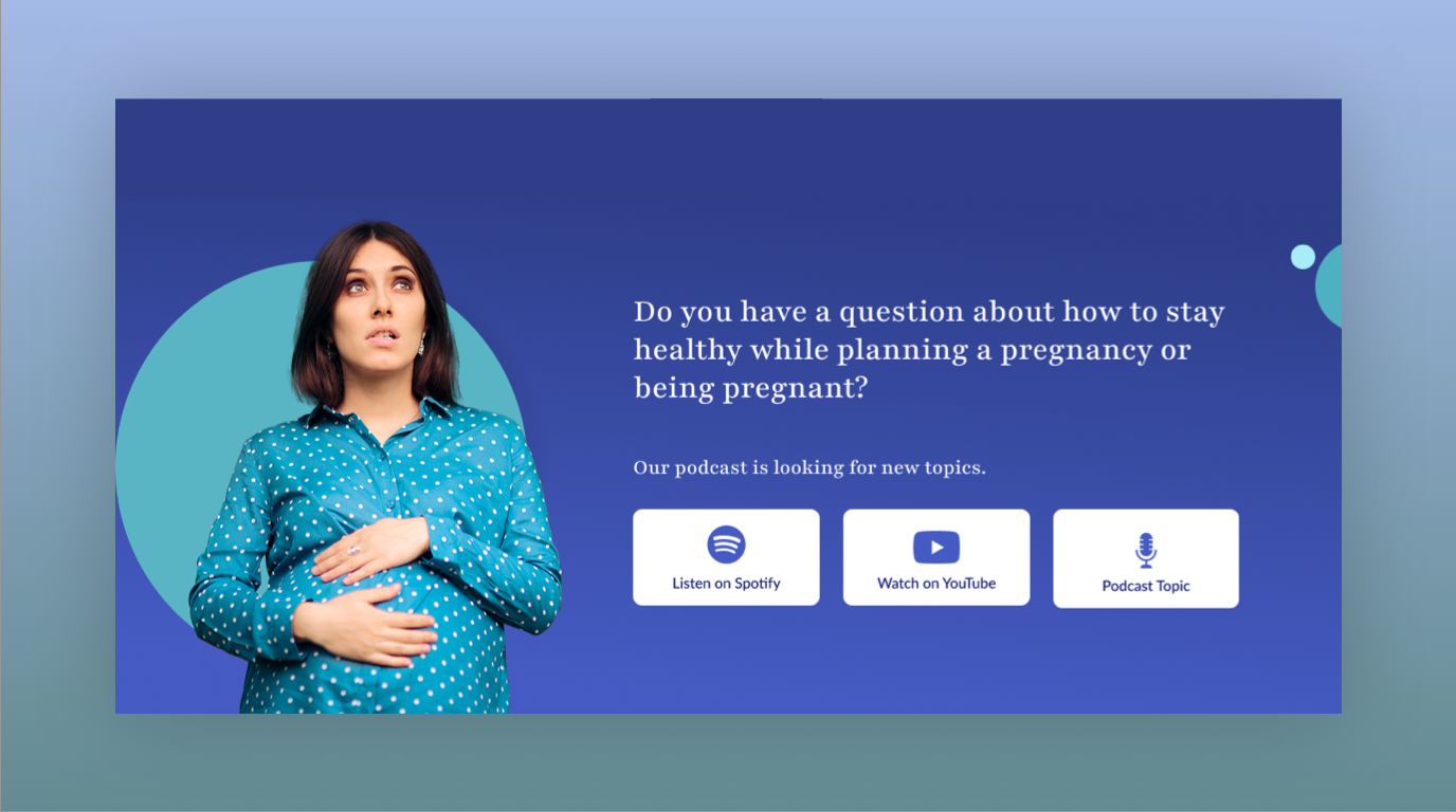
A fetal diagnosis can change the course of a family's pregnancy in an instant, bringing fear, uncertainty, and an overwhelming search for answers. The Fetal Health Foundation is a nonprofit dedicated to supporting families facing fetal syndrome diagnoses by providing trusted medical information, connecting parents with specialized care, offering emotional support, and advancing research.
The website plays a critical role in that mission. For families navigating some of the most difficult moments of their lives, it can be a first point of contact for answers, guidance, and reassurance that they are not alone. The experience needed to make complex medical information accessible while helping families find the resources, specialists, and support they need to make informed decisions.
The Creative Challenge: One of the biggest challenges was finding the right balance in the imagery and overall visual tone. Fetal diagnoses are deeply personal and emotionally complex, and families visiting the site may be experiencing fear, grief, or uncertainty about their baby's future. The imagery needed to acknowledge the seriousness of these experiences without making the site feel overwhelming, clinical, or frightening.
The goal was to create a visual experience that feels compassionate, trustworthy, and hopeful without minimizing the reality families face. Thoughtful image selection, natural photography, and a restrained visual approach help communicate empathy while allowing the content and resources to remain the focus.
The Approach: The design brings together clear information architecture, accessible content presentation, and sensitive visual storytelling. The website needed to serve multiple needs, from families searching for diagnosis-specific information and treatment options to parents seeking emotional support, connections with experienced families, and guidance toward specialized fetal care.
Every design decision supported a larger goal: making it easier for families to find credible information and feel supported during an incredibly vulnerable time. The result is a digital experience designed to bridge the gap between medical expertise and human connection, helping turn uncertainty into understanding and giving families a place to begin navigating what comes next.
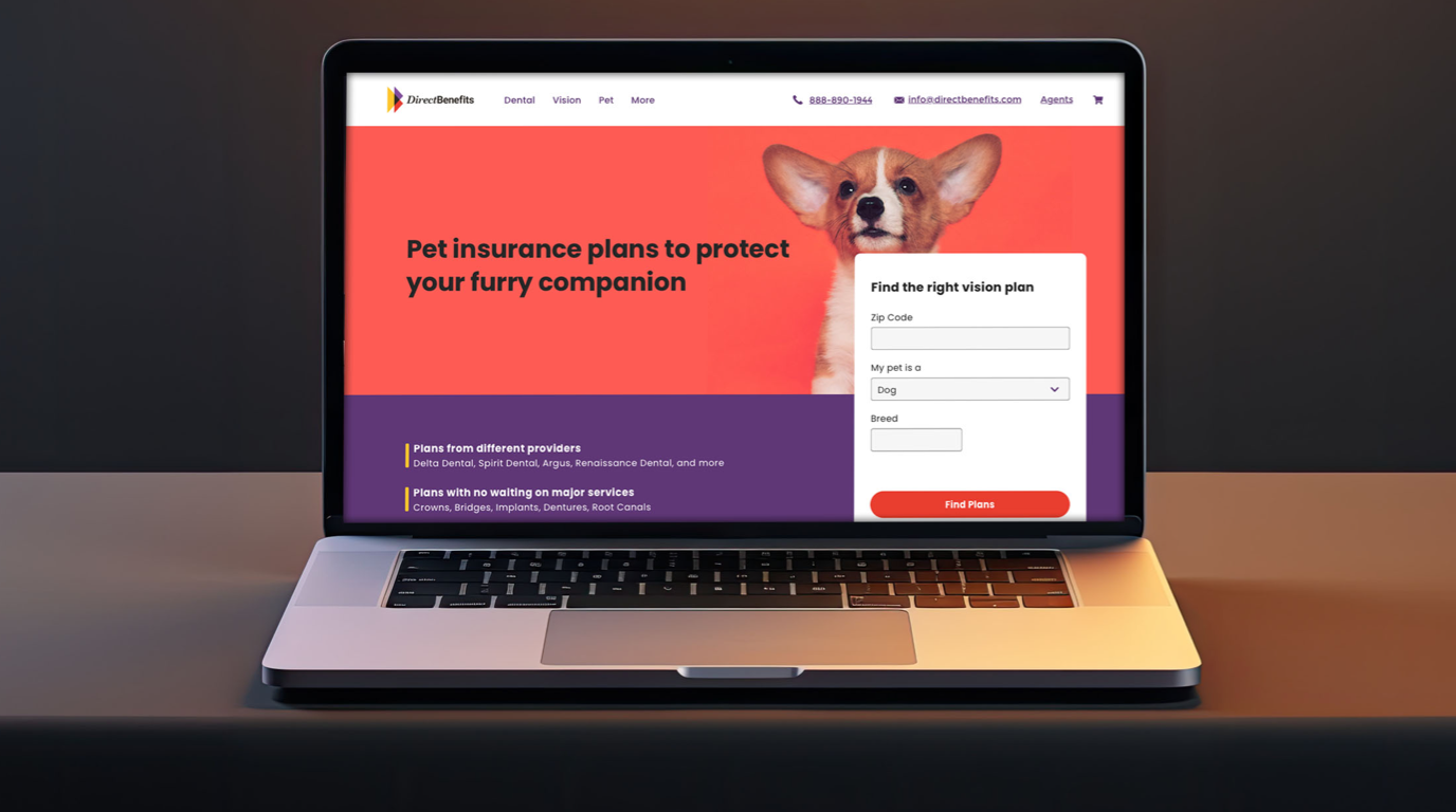
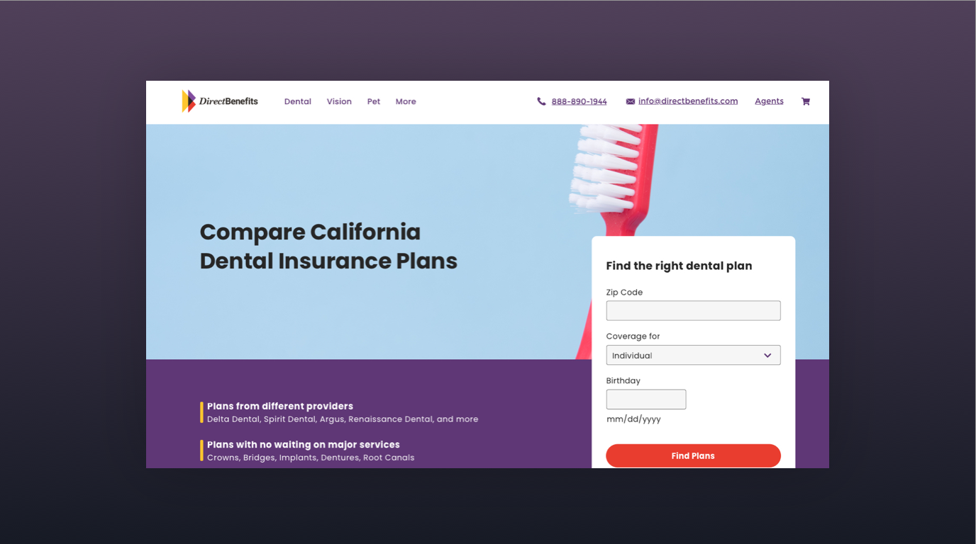
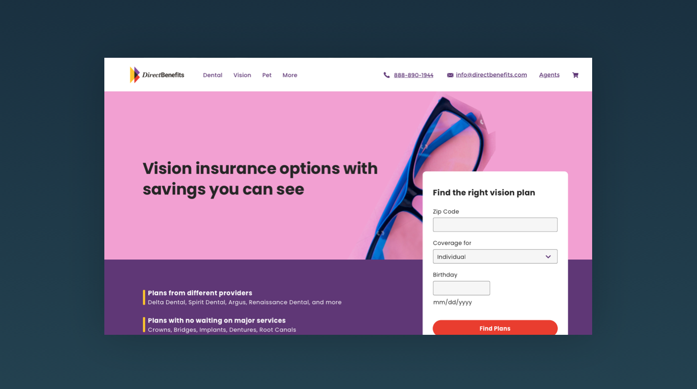
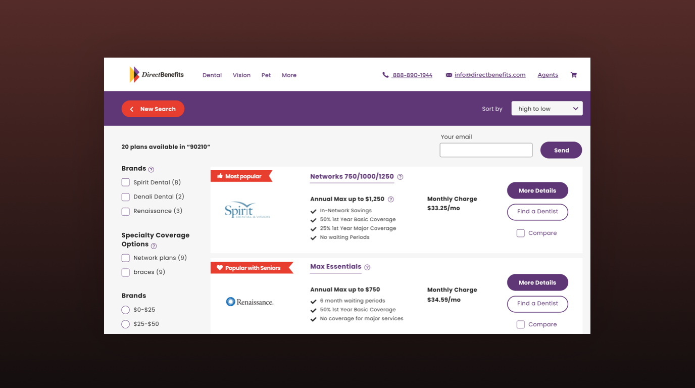
Direct Benefits, a platform facilitating connections between insurance customers and providers to compare plans, underwent a website redesign aimed at enhancing usability and refreshing its visual identity. The primary objectives were to streamline the user experience and update the site's appearance to better resonate with its target audience.
Simplified User Experience: The website redesign prioritized ease of use and navigation to ensure a seamless experience for visitors seeking insurance options. Through strategic information architecture and intuitive user flows, I restructured the site to guide users effortlessly through the process of comparing plans. Clear calls-to-action and simplified forms were implemented to streamline the journey from exploration to decision-making, empowering users to find the right insurance plan with minimal friction.
Updated Visual Identity: In aligning with Direct Benefits' goal of modernization, the website received an updated visual identity characterized by contemporary design elements and a refreshed color palette. Clean and minimalist aesthetics were employed to convey professionalism and trustworthiness while maintaining a friendly and approachable tone. Vibrant imagery and engaging graphics were strategically integrated to enhance visual appeal and capture the attention of visitors, fostering a positive impression of the brand and its services.
Responsive Design: Recognizing the importance of accessibility across devices, the website redesign embraced responsive design principles to ensure optimal viewing experiences on desktops, tablets, and smartphones. By adapting layout and content presentation to suit various screen sizes and resolutions, the redesigned site offers a consistent and cohesive experience across all devices, catering to the diverse needs and preferences of users accessing the platform from different devices and locations.
Outcome: The website redesign for Direct Benefits delivers a user-friendly experience with an updated look that resonates with its target audience. By simplifying navigation, refreshing the visual identity, and implementing responsive design, the redesigned site empowers users to explore insurance options with ease and confidence. With a focus on usability and aesthetics, Direct Benefits continues to fulfill its mission of connecting customers with insurance providers to find the plan that best suits their needs.
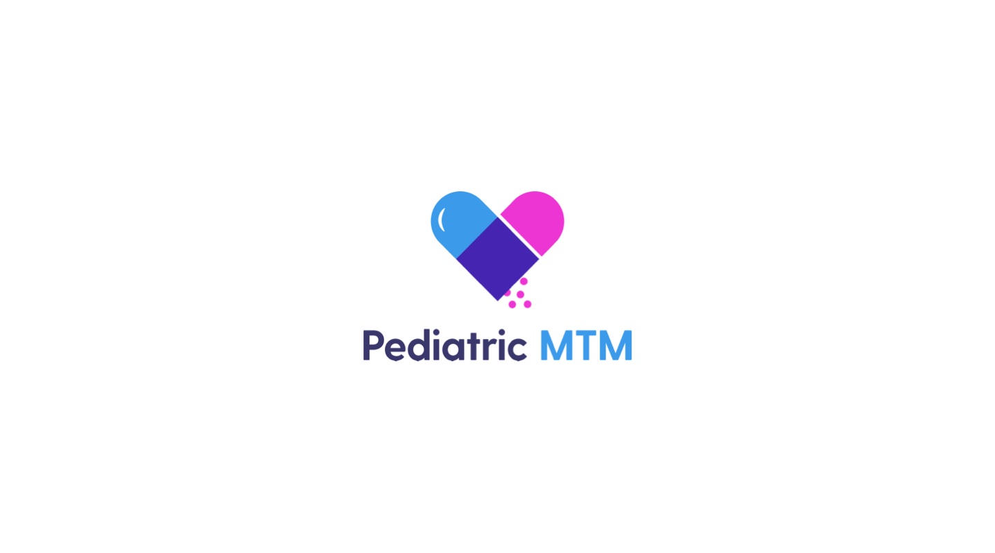
Pediatric MTM, a medical department at the University of Colorado, required a new logo design to reflect its specialized services with a focus on pediatric care. The logo incorporates a heart design intertwined with a pill to symbolize compassion, health, and medical expertise tailored specifically for children. The use of blue, pink, and purple colors represents inclusivity and diversity within the pediatric community.
Symbolism and Design Elements: The logo design for Pediatric MTM utilizes a heart shape intertwined with a pill, cleverly merging medical symbolism with a representation of care and compassion. The heart symbolizes love, empathy, and the central role of caring for children's health and well-being. Meanwhile, the pill represents medical expertise and the department's focus on providing specialized treatment and medication tailored for pediatric patients. This combination of symbols creates a visually compelling and meaningful representation of Pediatric MTM's mission and services.Inclusive
Color Palette: The use of blue, pink, and purple colors in the logo design reflects the diversity and inclusivity of the pediatric community served by Pediatric MTM. Blue symbolizes trust, stability, and professionalism, conveying confidence in the department's medical expertise. Pink represents compassion, nurturing, and sensitivity, emphasizing the caring and empathetic approach taken towards pediatric patients. Purple signifies creativity, innovation, and inclusivity, highlighting Pediatric MTM's commitment to providing comprehensive and personalized care to children of all backgrounds and needs.
Outcome: The new logo design for Pediatric MTM effectively communicates the department's focus on pediatric care with a blend of medical expertise and compassion. Through the integration of heart and pill symbols and the use of inclusive colors, the logo captures the essence of Pediatric MTM's mission to provide high-quality and inclusive healthcare services to pediatric patients at the University of Colorado and beyond.
AdventureMed stands as a premier authority in medical practice for professionals operating in wilderness conditions, seamlessly merging medical expertise with outdoor exploration. The concept behind the branding aimed to marry the medical component with the spirit of adventure and the great outdoors. In addition to designing their logo, I undertook the creation of their published textbook and the development of their website.
Logo Design: The logo for AdventureMed embodies the fusion of medical expertise and outdoor exploration. By incorporating elements evocative of both realms, such as medical symbols and iconic outdoor imagery, I created a distinctive mark that captures the essence of the brand. Vibrant colors and dynamic typography further reinforce the sense of adventure and vitality associated with the brand, while maintaining professionalism and authority in the medical field.
Textbook Design: The design of AdventureMed's published textbook reflects the brand's commitment to providing comprehensive and practical guidance for medical professionals operating in wilderness environments. Through careful layout and attention to detail, I created a visually engaging textbook that combines informative content with captivating imagery and illustrations. Clear organization and intuitive navigation make the textbook an invaluable resource for medical professionals seeking to enhance their knowledge and skills in wilderness medicine.
Website Development: AdventureMed's website serves as a central hub for information, resources, and community engagement. In designing the website, I prioritized user experience and accessibility, ensuring that visitors can easily navigate and find the information they need. Interactive features such as search functionality, resource libraries, and discussion forums foster engagement and knowledge-sharing among members of the AdventureMed community. The website's design reflects the brand's adventurous spirit and commitment to excellence in wilderness medicine, reinforcing its position as a trusted resource for medical professionals worldwide.
Outcome: The branding, textbook, and website design for AdventureMed collectively embody the brand's ethos of merging medical expertise with outdoor adventure. Through cohesive branding elements, visually engaging design, and user-centric website development, AdventureMed establishes itself as a leading authority in wilderness medicine. The seamless integration of medical knowledge and outdoor exploration encapsulates the essence of the brand, empowering medical professionals to thrive in challenging and remote environments.
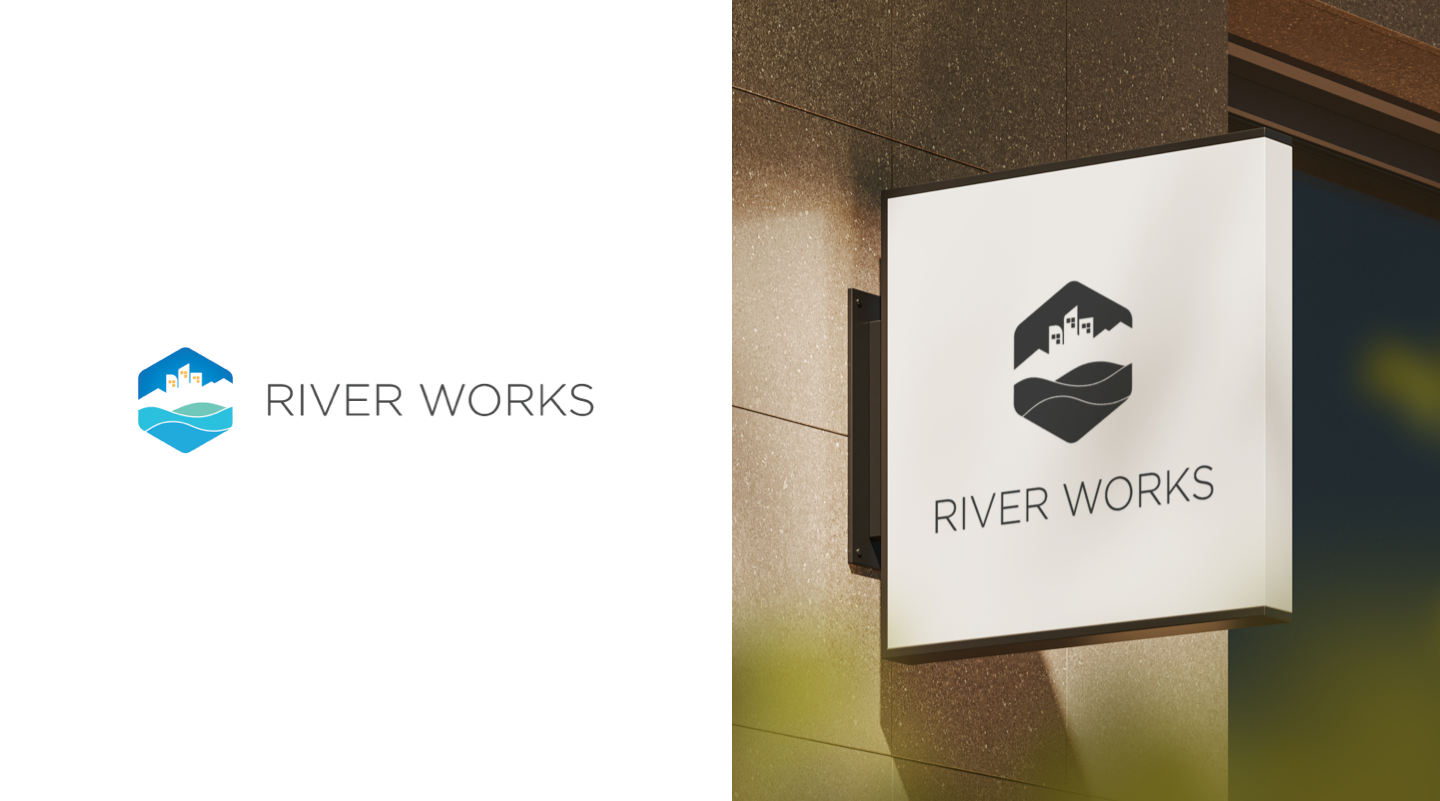
Riverworks specializes in city development and utilizes watersheds in urban planning initiatives. The goal in creating their logo was to seamlessly blend a city skyline silhouette with flowing water elements into a modern and visually appealing design.
Incorporating City Silhouette and Water Motifs: The logo for Riverworks was conceptualized to reflect the organization's unique focus on city development and water management. To achieve this, I combined a simplified silhouette of a city skyline with abstract, fluid lines representing flowing water. By integrating these two distinct elements, the logo symbolizes the intersection of urban infrastructure with natural waterways, conveying Riverworks' commitment to sustainable and integrated urban planning solutions.
Modern Design Aesthetic: Embracing a modern design aesthetic, the Riverworks logo features clean lines, geometric shapes, and minimalistic details. The use of bold typography further reinforces the contemporary look and feel, while ensuring legibility and impact across various applications and sizes. By prioritizing simplicity and sophistication, the logo exudes professionalism and innovation, positioning Riverworks as a forward-thinking leader in urban development and watershed planning.
Visual Representation of Brand Identity: Through the incorporation of a city skyline and flowing water motifs, the Riverworks logo serves as a visual representation of the organization's brand identity and core values. The juxtaposition of urban and natural elements reflects Riverworks' mission to harmonize city development with environmental sustainability, emphasizing the interconnectedness between urban infrastructure and water resources. The modern design conveys a sense of progress and dynamism, signaling Riverworks' dedication to shaping resilient and vibrant cities for the future.
Outcome: The logo design for Riverworks successfully encapsulates the organization's mission and values in a visually compelling and memorable mark. By seamlessly integrating city silhouette and water elements into a modern design aesthetic, the logo communicates Riverworks' commitment to sustainable urban development and watershed planning. As a distinctive visual symbol, the logo strengthens Riverworks' brand identity and establishes a strong visual presence in the field of city planning and environmental stewardship.